Ray Parker: Works On Paper
by Vincent Katz
In the late ‘50s and early ‘60s, Ray Parker made a series of oil paintings which brought him his greatest success up until that point. He called them his Simple Paintings, a term he used to differentiate them from earlier, Cubist-influenced, abstractions. In the Simple Paintings, Parker wanted to remove all drawing and work only with color and simplified form. In a statement published in It Is in Spring, 1958, Parker wrote, “...the only forms acceptable are directly inherent in the artist’s materials. This means no representation and no programmatically chosen limitations of formal elements, as in ‘abstract’ painting.” There would be no geometry, no narrative, no mental construct imposed from without. He would work from within the color, without pre-planning or studies, letting its specific nature guide him.
The impression these paintings give is not rapid, and “improvisation” may be the wrong word to characterize them (though it could be used regarding some from-the-tube lines he introduced over fields in the 1970s and ‘80s). Around 1960, Parker’s approach was meditative, contemplative, slow. The marks, made by rags, show this, and the shapes in these pieces have a still presence which communicates their calm to the viewer.
He went so far as not to stretch his canvases before painting, to avoid even the “drawing” made by straight lines framing the image. After he finished painting, Parker would determine where to frame, only then stretching these large-scale works. With the small Simple Paintings, a group of which was shown for the first time at this gallery in the Spring of 1997, Parker would frame by actually cutting them out of the canvas, then mounting them on another canvas, framed to the size specifications of the cut image.
The pieces in the current exhibition, done in oil or India ink on paper, relate to the Simple Paintings. These works on paper came to light only six months ago and are part of a continuing revelation of aspects of Parker’s career. Color images are being shown with black and white pieces and one large oil, although the works on paper were not studies in the traditional sense. Parker also made pencil drawings, but they never became large paintings; nor did the painted works on paper.
The black and white images are on sheets 15-1/4 by 23 inches, the color ones on sheets half that size. The explanation for this is simple. They were judged to contain two separate images and have been cut in half so that these images may exist on their own. While it is interesting to view them together (and some have been preserved this way), as they create a cumulative, echoing, force, like I Ching throws, we can observe that, separated, the pictures resemble other images from the Simple Paintings series.
Sheets of ideas completed in an afternoon, these paper works were stashed away in a drawer, left behind as the artist moved on to the next. Often, the same or similar colors are used in different paintings. Sometimes, colors and textures from half of one sheet crop up on half of another, suggesting that Parker might make more than one sheet of paintings in a single day.
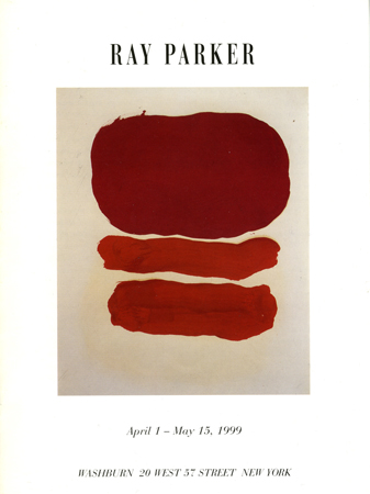
There are two major themes in these works -- layering and clustering. In the former, one weight always impacts on another, whether it be in an elongated, oblong, figure, or a more ovoid, rounded one. This sense of heaviness is indebted to Mark Rothko’s dense fields. More original, perhaps, are Parker’s clusters of several ovoids, where hierarchy becomes uncertain, weights flow more freely and circularly. The two themes also interweave, as Parker varies tones, surfaces, relationships, and sizes. The indistinct nature of the shapes is appealing. There is always some movement at the termini of a form which lightly propels it into the surrounding space.
In Number Eight, a russet oblong with two lavender balls is paired with two oblongs -- one lavender, the other russet. Traces of creamy froth floating on the purple surface reveal the work to be pure in emotion but not tone. Variations in modulation keep the surfaces alive. Strokes and different intensities of light are visible. Attendant spatter or drip is non-tendentious but generous -- in control, but not controlling.
In Number Fifteen and Number Six, the same colors and textures are used differently. Probably they were composed by Parker at the same time. In both, a characteristic juxtaposition of texture -- matte and light impastoes laid side by side -- forces the eye to bounce back and forth. In Number Six, Parker chose to paint four alternating oblongs; in Number Fifteen, two large ovoids with ragged edges. The latter results in a much more floating, airy, composition than the former.
The format of each black and white work is horizontal, the images composed again of shifting arrays of oblongs and rounds. Reducing his palette to the bare minimum, (while attaining variety of tone and texture) Parker goes for greater compositional complexity. The black forms swell to take up all space available to them, touching or almost touching edges of sheets on which they reside, leaving slight borders of white.
A climatic change grips the viewer: a darkening sky or other sudden shift in mood. This is the only work this premier colorist did in black and white, a breakthrough, essential, series -- yet apparently set aside by him after finishing it. These are artifacts of states of mind, dark but not grim, emotionally roiling. A Rothkoesque weight still informs images like Black And White Number Six, where one imposing black oblong dominates a slimmer one beneath it. The urgency of the strokes gives both bodies a continuous energy, so the story is forever unfolding; we have no way of telling what the final result of the interaction will be.
The black and whites also bring to mind subsequent artists, as diverse as Richard Serra and Donald Sultan. Black And White Number Seven recalls the latter, with its cluster of monochrome, fruitlike, balls. These pieces make clear Parker’s position midway between the gestural abstract work that preceded him and the minimal work of artists to come. Endless details are visible within the eight balls huddling closely together. In different densities of ink, one makes out not brushstrokes but murky outlines flitting back and forth. They move within the confines of a given black globe, energies trapped by the artist-alchemist.
The points of connection between shapes are not sharp. You trust the artist to take you into black, approving of his forays into color. A sense of foreboding prevails, but it is not death. Landscape on the verge of tumult, something welling up to the surface, intimated by thick-impastoed strokes, still creamy and confined to discrete areas, but now those regions are bumping into one another, as if about to explode, through no desire of their own perhaps, impelled by forces planted within them many years earlier.