|
Bright Variety:
Tom Wesselmann’s Recent Metal Abstractions
by Vincent Katz
For the casual observer, familiar only with Wesselmann’s iconic, faceless, nudes from the 1960s, his new abstract work may be a surprise. For those who have followed his peregrinations through the decades, it is a natural, though unpredictable, outgrowth of his restless, searching, intellect. Even in the early years, he resisted the shackle of the term “Pop,” assiduously avoiding any commercial, namebrand, reference in his subsequent work. In retrospect, his concerns are seen to be in fact distinct from those of conceptualists like Warhol and Lichtenstein.
While influenced, as many Pop and non-Pop artists were, by advertising’s exploding, radically cropped, tonally reduced, images, Wesselmann’s art, unlike Warhol’s, now seems to be firmly based in traditional art. In essence, his project was to make a contemporary version of that Renaissance vision, the reclining nude: Titian’s Venus transported to a studio apartment. Even the accoutrements -- windows, flowers, hanging artworks -- that fill up Wesselmann’s spaces form the habitat of a woman of leisure much as they have always done.
Wesselmann has long made three-dimensional artworks --Bathtub III from 1963 was a painting of a nude toweling herself dry, extended by an actual hamper, door, and towel -- and contoured two-dimensional works. In the early 1980s, for instance, he made a series of shaped paintings on aluminum and canvas, whose highly idiosyncratic borders delineated negative spaces of other images or at times remained intransigently indecipherable. These works have always felt like paintings, though, extrapolated two-dimensional ideas, as opposed to sculpture.
He moved towards abstraction in his Great American Nude series and by the end of the ‘60s was working in what could be considered a large-scale collage format -- not literally, as the works were all Liquitex or oil on canvas, but effectively, in the blunt juxtaposition of large, often highly simplified, forms. His large paintings of the ‘70s featured cropped female faces, but now with all the details of features and expression included, butted up against flowers, furniture, and fishbowls.
In the 1980s and ‘90s, he has moved increasingly towards a lyrical, linear, blending of representation and abstraction in successive series of starkly simplified drawings that started out as Liquitex on bristol board and with increasing frequency were transferred -- first mechanically, then via computer laser cutting -- to steel or aluminum linear wall pieces. Where his early nudes had a much greater proximity to the styles of billboard and advertising design, recently they have acquired a distinctly Matissean flavor. One is aware of the artist’s hand in the bold, thick, lines that have become as emblematic as open, unmodulated, areas were previously.
It is possible now to look back and see these paths in Wesselmann’s work as moving towards the large-scale abstractions in which he is now engaged, but no one but the artist could have foreseen the quantum leap into actual non-representational work that he took in the early ‘90s. As often in the past, the artist has turned a corner, notching up his enterprise into a different way of working.
This is the second exhibition of Wesselmann’s large-scale abstract oil paintings on metal. As a young artist, he was impressed by Willem de Kooning but realized he had to cut his own path. Years later, he has decided to return to his early interest in abstraction, but in his own way of working. The paintings of de Kooning’s which Wesselmann’s most resemble are those he painted around 1960, in which he allowed broad statements and clear areas of color to remain. These sections often have the feeling of single brushstrokes, even though they may be composite. In his new work, Wesselmann engages in similar formal concerns. These paintings function by maintaining balance over a series of oppositions: in impulse and direction; between large and tiny scale; solid and translucent planes; hard and soft edges; truncated and integral forms; bright and dull colors. They are not gigantic; they do not overwhelm the viewer. Although they have a third dimension, they are paintings, not sculptures or even reliefs.
The subject matter of the new abstract works is the artwork as artifact. Wesselmann enables us to view, up close, the details of facture. In greatly enlarging tiny fragments of brushstrokes, there is an element of Lichtenstein’s heroicizing (and at the same time denigrating) the brushstroke, but the effect is different. Where Lichtenstein played on the continuity of effort in the artist’s mark-making, the signature “handwriting” that makes each artist unique, Wesselmann takes this uniqueness for granted. These are, after all, his own strokes amplified -- his own signature. He is working with an idea of fragmentation, that disparateness can lead to a conclusive whole, just as, in his earlier work, a methodical production of recognizable image-making led to one.
Translucency is a major aspect of these works, highlighting the facture of oil painting, where colors are seen through colors, lights through other lights. We are continually finding new depths in these paintings, both illusionistic ones, where Wesselmann has painted a background form seemingly visible through the foreground form, and physical ones, as different curving planes of metal, painted discrete colors, float in space and jostle for our attention.
Abrupt straight-edges -- the result of collaged mylar cuttings, on which these pieces are based -- work to counter the surging energy of curving strokes. The strokes themselves are often truncated, lending them a hesitant, potent, quality that Lichtenstein’s stroke-portraits lack. Formally, the paintings mimic, but do not replicate, the rectangular format of paintings. They are by and large rectangular in feeling, but odd curves, jagged edges, and indents take the works off a predictable course, adding a layered subtlety to the final effect.
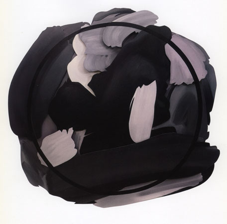
In a recent series, Wesselmann makes this effect even more pronounced. In the group titled Rounds, he paints a think black circle (in one case the circle is a separate metal cut-out) over a series of grisaille brushstrokes, which align themselves into a more-or-less circular format. These Rounds are interesting too as Wesselmann did not take their motifs from cut mylar, but rather painted them freehand -- extremely small, in order to diminish manual control. Since they do not derive from cut forms, there are no hard edges, making them conducive to the circular motif. Instead of rectilinear borders, stops, there is an inclusive collection of unmitigated gestures, which still do not add up to a single, simplified, statement. Instead, they lead us in several directions at once. In Round 3, for instance, a strong impetus is set in motion by the large dark-grey oblong form which tilts up from lower left at the bottom of the image. This momentum is countered by an equally powerful dark vertical form in the center of the image. This basic scissoring is then refined by echoing and contrasting forms, all painted in grisaille.
The attack is different in every work. Back to Blue is the new piece that most blatantly celebrates the brushstroke, allowing it to be represented in straight lines, a diagonal, and most dramatically, a pulsing, sinuous, swath at the center of the image. In Liquid Green, a pale green snakes through the composition, a network connecting at various points throughout its path. It is curious for its unmodulated character. The profusion of hot color and sudden, fragmented, forms adds up to an image of graphic impact.
Pink Pearl is also dominated by a single color statement, this time in strips of fleshy pink much thicker than the greens of Liquid Green. In Pink Pearl, the pink is modulated, with grey painted into the pink, supplementing and highlighting it. As often in these pieces, a certain tone will help to anchor the disparately flying colors. In Pink Pearl, this function is performed by two sections of lavender near the top, surrounded by a medley of deep blues and purples. Not only is the lavender far back in the physical set of planes; it also recedes tonally, countering a shaft of bright orange that streaks under the pinks at the middle of the work and a pungent lemon yellow, which makes a brief appearance in the lower right corner.
North Branch has one of those enigmatic, floating, forms that were so memorable in Wesselmann’s previous exhibition of abstract works. A self-sufficient green hovers near the bottom of the piece, none of its edges clipped. It is more than a simple representation of a brushstroke. This re-painted found piece of painting becomes a vibrant element in itself, an expressive vehicle that counters the more strident, brushy, statements in bright yellow, pale green, and ocher.
The most recent piece is Red Eddy, whose color combinations remind one most explicitly of Wesselmann’s idol, de Kooning. The shapes work harmoniously, pushing towards the lower right corner, never relaxing their complementary tensions. There is always an air of floating, of expectation, as though the forms are on the balls of their feet, ready for the next movement. Two curving impulses -- one pink, the other a bright red and orange combination, which gets picked up by a beige -- echo each other and weigh against the pointed attack to the lower right corner by a central, translucent, yellow, headlike shape. Countering this downward force is a large, pulsating, orange area at top left, defined by underlying black streaks we seem to be seeing through it.
Wesselmann work has many facets. He is constantly refining those facets, embellishing them with slightly different ramifications, in terms of scale, color harmony, and level of abstraction. Every once in a while, he takes a bold leap, leaving us standing in wonder before his new pieces. By now, we should be prepared to expect that Wesselmann will always be moving into new territory, always surprising us.
|